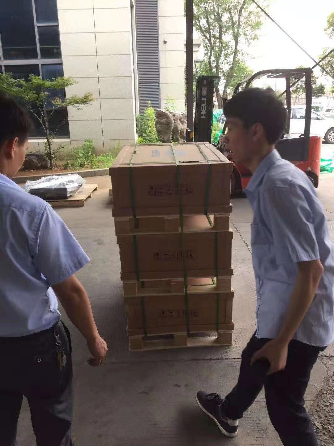
瓦楞纸箱是应用广泛的包装产品之一,以其优越的性能和良好的加工性能逐渐取代木箱等运输包装容器,成为运输包装的主力军。除保护商品、方便储运外,还起到美化、宣传商品的作用。瓦楞纸箱的布局设计应该注意什么?下面小编带大家一起来了解一下。
Corrugated box is one of the most widely used packaging products. With its superior performance and good processing performance, it gradually replaces the wooden case and other transport packaging containers, and becomes the main force of transport packaging. In addition to the protection of goods, convenient storage and transportation, it also plays a role in beautifying and promoting goods. What should be paid attention to in the layout design of corrugated box? Let's take a look at it with you.
1、瓦楞纸箱印刷图形标识应规范,图形印刷质量不于清晰易分辨,而且要符合标准。
1. Corrugated box printing graphic identification should be standardized, graphic printing quality is not only limited to clear and easy to distinguish, but also to meet the standards.
2、瓦楞纸箱的版式设计应考虑适合印刷,因为瓦楞纸箱的印刷一般比三色印刷多,对于需要叠印的瓦楞纸箱。设计时应严格布局位置和尺寸,以使色彩准确。如果你在一种颜色内叠印其他颜色,而且这些颜色之间没有间隙,你应该考虑到企业印刷机的精度,这样两种颜色的布局是重叠的,重叠部分的宽度就是印刷机的印刷误差。为了避免瓦楞纸箱印刷糊版,在满足用户要求的情况下,尽量使阳字笔画变细,阴字笔画变粗,从而增加笔画间距,不易造成印刷模糊现象。
2. The layout design of the corrugated box should be suitable for printing, because the printing of the corrugated box is generally more than the three-color printing, for the corrugated box that needs to be overprinted. The layout position and size shall be strictly controlled in the design to make the color accurate. If you overprint other colors in one color, and there is no gap between these colors, you should consider the accuracy of the enterprise printing machine, so that the layout of the two colors is overlapped, and the width of the overlapped part is the printing error of the printing machine. In order to avoid the corrugated box printing paste, under the condition of meeting the user's requirements, try to make the strokes of positive characters thinner and the strokes of negative characters thicker, so as to increase the stroke spacing, which is not easy to cause the printing blur.
3加强校对瓦楞盒使用文本打印的布局,一般来说,瓦楞盒的布局错误很容易被忽视,往往或多或少一定错一个词,一旦设计布局问题没有被纠正,后果将不堪想象。校对时,校对勘误表必须逐一进行。
3. Strengthen the proofreading of the layout of corrugated box using text printing. Generally speaking, the layout error of corrugated box is easy to be ignored, often more or less a word is wrong. Once the design layout problem is not corrected, the consequences will be unimaginable. When proofreading, the errata must be proofread one by one.

4、整体布局要合理,瓦楞纸箱的整体布局要合理,防止头重脚,字体大小要适中,比例要协调,印刷位置要适当,瓦楞纸箱的边缘距离要大于20mm。另外,大多数企业对瓦楞纸箱的印刷质量没有一个的了解。在某种程度上,他们忽视了包装的美化和市场性。字体选择不当,比例失衡,布局混乱,影响美观。
4. The overall layout shall be reasonable, the overall layout of corrugated box shall be reasonable, to prevent head weight and foot weight, the font size shall be moderate, the proportion shall be coordinated, the printing position shall be appropriate, and the edge distance of corrugated box shall be greater than 20 mm. In addition, most enterprises do not have a comprehensive understanding of the printing quality of corrugated boxes. To some extent, they ignored the beautification and market of packaging. Improper font selection, unbalanced proportion, disordered layout, affecting the beauty.
